
P26 Brand Identity
In short
A brand system for an AI and technology studio: the P26 mark, colour and type, print and office templates, social profiles and the guidelines that hold it together. Industry: Professional Services. P26 had a name and a direction but no system: no rules for the logo, colours chosen page by page, and no templates for cards, proposals or social profiles.
- Industry
- Professional Services
- Year
- 2026
- What we did
- Consulting, Build
- Live product
- Visit live site ↗
- Video
- Case study
- Download PDF ↓
Watch
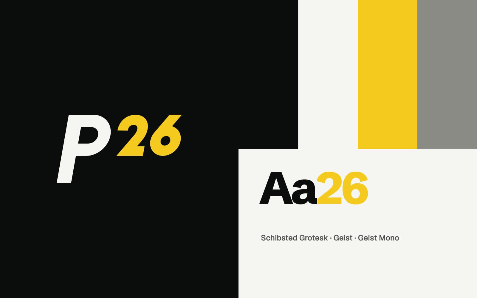
One mark, used the same way everywhere.
Summary
P26 had a name and a direction but no system: no rules for the logo, colours chosen page by page, and no templates for cards, proposals or social profiles.
We built the identity around one idea, results that compound, and turned it into a kit the team uses for every document and channel.
What we did
Strategy
- The idea: measure, focus, compound, and the line "Results that compound."
Mark
- Logo explorations, the routes we tested and the final P26 mark with its 10° lean
- Clear space, minimum sizes and the yellow 26 used only on Ink
Colour and type
- Ink, Paper, Solar and Stone; Schibsted Grotesk, Geist and Geist Mono
Print and office
- Business cards in Ink, Solar and Paper, letterhead, a Word proposal template and Outlook signatures
Social and documents
- Profile pictures and covers for LinkedIn, YouTube, Instagram, X and Facebook in three variants
- An 8-page company profile, brand guidelines and a press kit
Built with
- Brand strategy
- Logo design
- Typography
- Social media
More work.
Start a project.
Tell us what you need in four short steps, or book a call with the founder. We reply within one business day.